top of page
FLY UX
UX Design Institute
Designing a responsive airline booking website
00
Project goal
To design a website for a start-up airline with a fast, easy and intuitive online experience based upon a deep understanding of target users.
Problem statement
Booking a flight should be an exciting process, planning a trip away for fun, adventure or relaxation. However, the reality often falls short, with the user experience often stressful, confusing and unpleasant. Navigating through endless options, dealing with payment gateways, trawling though last-minute deals and encountering hidden charges can be overwhelming. Moreover, the way users book air travel is constantly evolving, from calling up booking agents to endless online browsing, adding yet another layer of complexity.
With 90% of bookings still occurring on desktop browsers, this case study focuses on enhancing the desktop booking experience, with an aim to identify and resolve the usability issues prevalent in existing airline websites. Several research methodologies have been employed; including competitive benchmarking, online surveys and usability testing to collect valuable quantitative and qualitive data to define the most prominent use cases, frustrations and common behaviours experienced during the booking process.
Through thorough analysis of the raw research data, user patterns and common interface challenges were identified to inform the design process. The iterative design-prototype-validate approach was then employed, culminating in a clickable prototype and detailed wireframes ready for user testing. This comprehensive UX process was instrumental in crafting a solution aimed at alleviating user pain points and improving the overall booking experience.
01
Research
Collecting valuable research data was fundamental to inform how the functional, aesthetic and experience design of the website should perform and align to user mental models. All design decisions were based on insights acquired during this pivotal stage. The triangulation method was implemented, using multiple data sources to identify usability patterns and ensure a comprehensive understanding of the data.
Throughout the research process, assumptions and presuppositions were avoided, prioritising empirical evidence and user feedback to drive informed decisions. This rigorous approach facilitated the creation of a design that authentically addresses user needs and preferences.
Competitive Analysis
Competitive benchmarking analysed how some of the top competitors in the airline industry respond to problems encountered during the booking process. The research objectives defined were to understand industry conventions and highlight both best practices and pain points.
Four airline websites were analysed:
-
British Airways
-
Easy Jet
-
Emirates
-
Ryan Air
Using the 10 usability heuristics, observations were recorded using the below legend:
-
Green = Good UX
-
Amber = Could Improve
-
Red = Bad UX

Survey Questions
Survey questions were sent to a select number of participants to collect both quantitative and qualitive data. The data received provided valuable feedback about user goals, frustrations and their experience of booking features.


Usability Testing
Usability testing yielded valuable insights into user perspectives, goals, positive interactions and issues that they often encounter. Recognising that 90% of communication is non-verbal, observing user’s actions directly within the software proved to be immensely beneficial. The usability testing was conducted and recorded on Microsoft Teams. Each usability session used in this case study was meticulously documented. Post session, recordings were reviewed and in-depth notes were compiled, capturing key insights essential for informing future design decisions.
The usability testing sessions were divided into three parts:
-
In depth interviews about past experiences of booking flights online
-
Usability testing of two existing airline websites.
-
Reflection


02
Analysis: define the problem
Having gathered the raw research data, the next step was to organise it and sort through the information to identify user behaviour patterns involved in the process of booking a flight online.
The categorised data could then be used to inform the design targets for the different stages of the flight booking and would reflect the most common use cases – user goals, behaviours and context of use. It also revealed the mental models that the software should accomodate as well as common pain points that should be designed out. Common successful conventions were also highlighted and provided inspiration for effective solutions to emulate.
Defining major objectives and successful criteria:
-
Simplicity
-
Price transparency
-
Time efficiency
Affinity Diagram
The unstructured data gathered from the user research was organised using the affinity diagram method to produce actionable insights. All of the research was gathered and relevant observations were noted on post it notes on Miro. The observations were then reviewed and organised into logical groups with each group being given a descriptive name. The main categories focused on the various stages of the booking process, while the sub-categories covered topics such as:
-
Context of use
-
User interface
-
System status
-
Clarify of information
-
Marketing / Upselling
-
Customisation
-
Preferences
Customer Journey Map
Insights from the affinity diagram were then used to formulate a customer journey map; a diagram that visualises the typical customer experience as users interact with the software. This was a valuable tool which presented a holistic view of the findings from an external perspective, effectively highlighting areas within the user journey that required fixing as a priority. By adopting the customer’s viewpoint, preconceptions from the design team could be eradicated and the main user problems could be elucidated at each stage of the process and focused on in the design solution.
The main issues uncovered by the customer journey map were:
-
Lack of visual hierarchy
-
Unclear user navigation and CTA buttons
-
User preferences not provided
-
Complicated user interface
-
Filtering and clarifying information
-
Lack of price transparency
03
Design
Once the most common user problems were defined, focus could then shift to providing a design solution.
User flow diagram
Creating a user flow diagram provided a visualisation of the journey a typical user would undertake when booking a flight, whilst also ensuring the information architecture addressed all of the concerns highlighted in the customer journey map. Despite potential variations in user context, focus was placed on the most common and critical user case scenarios to fulfil major goals and deliver a positive booking experience. This diagram provided valuable insight into the placement of various screens within the overarching structure, as well as their sequence and dependencies within the primary flow.


Wireframe with annotations
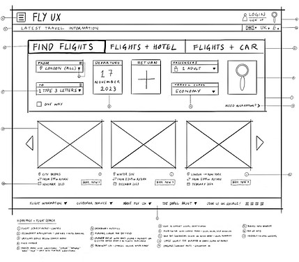
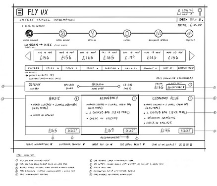
To meticulously design the interface, the process was initiated by creating a series of sketches, offering a low-fidelity rendition of the prototype. These sketches served as a blueprint to outline the key page components, visualise screen states, digital affordances and anticipate user navigation throughout the airline booking process. Leveraging sketching in the early design stages enabled potential problems to be identified early and solutions iterated accordingly.
Within this phase, sketches were delineated for various sections including the homepage, search results, fare options, review, extras, passenger details, and payment pages, laying the groundwork for the medium-fidelity prototype. Some examples are shown below.


04
Prototype
Drawing from these sketches, the concept designs were translated into a comprehensive airline booking prototype using Figma. This platform facilitated the development of visual hierarchy, navigation systems, and streamlined workflows, guided by established design conventions, patterns, and the categorised research data.
Directed by usability test feedback, the prototype was iteratively refined, addressing pain points until an optimal user experience was achieved and all identified issues. This iterative approach ensured the final design effectively met user needs and expectations.
Annotations
In the final stage of the process wireframes were created, accompanied by detailed annotations, serving as a comprehensive guide for developers to construct the application. These annotations encompassed essential information for all interactive elements, controls, rules, and workflows, ensuring clarity and precision in the development phase.
05
UI Elements
Colour pallet
Primary colour
#18435A
Secondary colour
#FE5F55
Auxillary colour #D7DDFF
Buttons
Typography
Poppins
Heading
Size 24
League Spartan
Sub heading
Body
Caption
Size 16
Size 12
Size 10
bottom of page
.jpg)
.jpg)
.jpg)

.png)


